Inclusive access
Semantic landmarks, skip link, descriptive alt text, keyboard focus states, larger text and high contrast controls support alternative access needs.


Assessment evidence
This page explains how the student redesign responds to usability, accessibility, construction and aesthetic assessment criteria.
The home page makes the site identity and mission immediate, then prioritises the three most common journeys: finding emergency food, donating and getting longer-term advice.
Persistent navigation, breadcrumbs and task cards help users move through the site without relying on hidden hover-only interactions.
Semantic landmarks, skip link, descriptive alt text, keyboard focus states, larger text and high contrast controls support alternative access needs.
The site uses an index page, one shared CSS file, noindex metadata, descriptive titles and consistent page structure.
The green palette reflects the original organisation and food/community theme, while the grid, cards and header treatments keep pages consistent.
Original site analysis
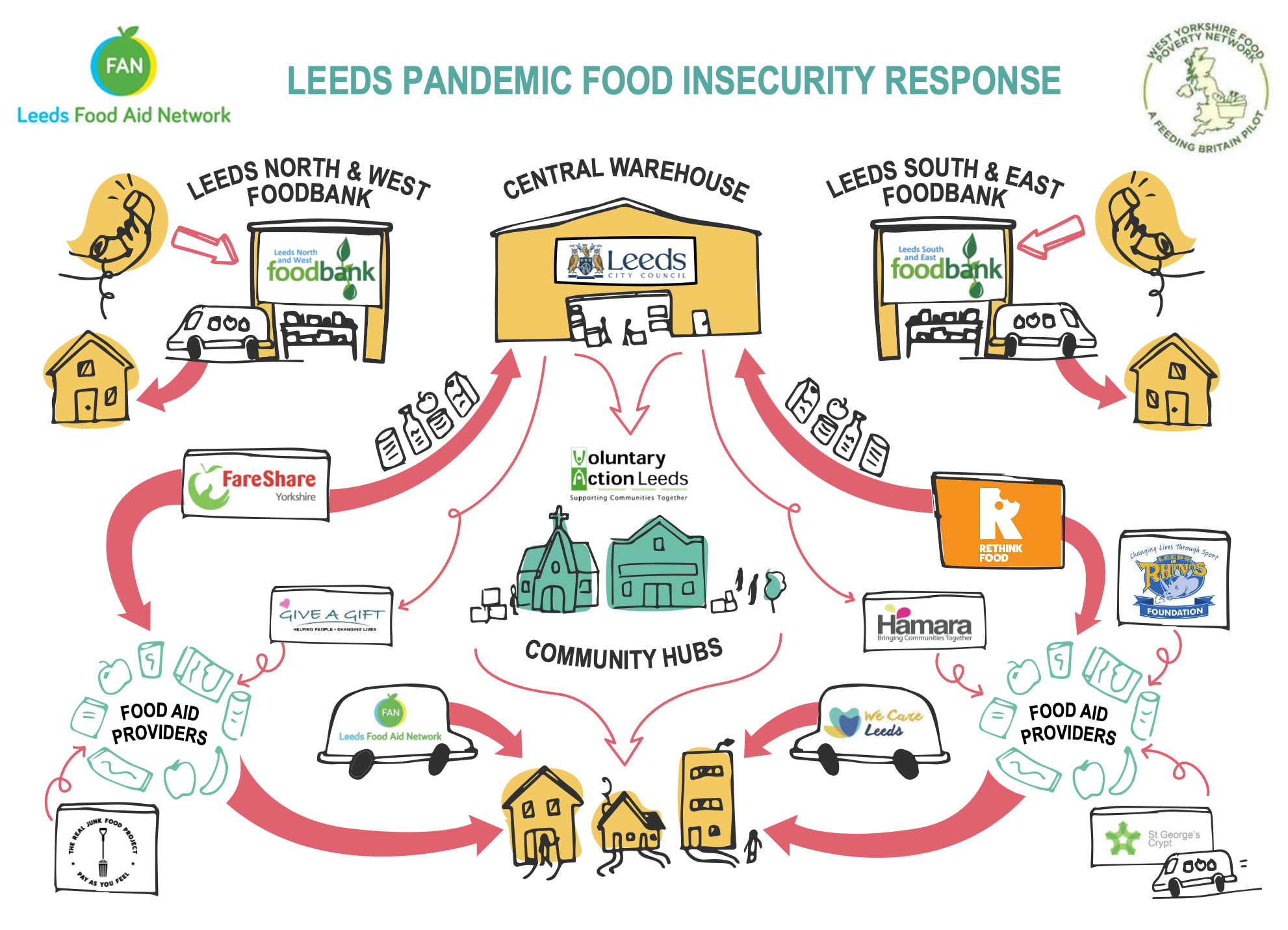
The original website uses a diagram to explain Leeds FAN's network of food providers, signposting, distribution and longer-term assistance. This redesign preserves that meaning while also presenting the journeys as readable cards and links that work for keyboard, touch and screen-reader users.
The redesign includes a student-project JavaScript banner, persistent display options, responsive navigation, reduced-motion support and real imagery from the original Leeds Food Aid Network website to preserve the organisation's identity.